Nursing Care

Summary
Epic Need: A nurse wants to create a website for her business. She wants to start a business on infusion therapy and holistic care.
Problem Statement: Many people don’t know what medications they’re taking, why they’re taking them, or even what chronic conditions they have and how to best manage them.
Solution: Creation of a website including a nurse-patient appointment system.
My focus area of solution: Design a platform environment so that nurses can direct patients to helpful services and send updates back to doctors if they wish.
COMPETITIVE ANALYSIS
| ReservationPage | A Company | B Company | C Company |
| Company Info | Korean Hospital Company | Korean Hospital Company | Canada Hospital Company |
| Reservation Method | – Fast reservation– Online reservation– Call | – Fast reservation– Online reservation– Call | – Online reservation– Call |
| Reservation Process | 3 Step(Select specialist -> Select Date -> Input Information) | 3 Step(Sign in -> Select Date -> Select Time) | more than 5 Step(Input Information) |
| User Experience | Normal | Great | Poor |
Insight
Reservation page:
– The first appointment process is going to be a simple and familiar page.
– before starting, the online appointment process, at least Users should choose to log in or input their personal information.
– The appointment process is not going to be over the 3 steps.
Wire frame
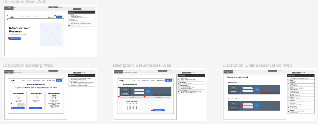
Key point
- I tried to tell you how to make a reservation intuitively and simply.
- By providing a login page, it is possible to log in and sign up on one screen, rather than increasing the number of steps.
- The process of making a reservation does not exceed 3 steps, making it simple to make a reservation.
Impact
If patients who do not know what to do are complicated to make an appointment, it will be difficult to take the next action and lose the purpose of the business. Therefore, we focused on “simple & easy” the most. Even beginners with no user experience will be able to access it easily.
Iteration
I have created two ideas regarding the appointment process. Through an iterative process, design A has been chosen as the final design.
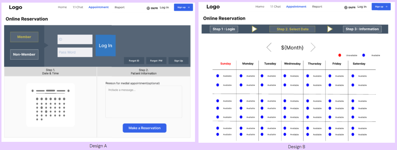
First of all, the most necessary information when making a reservation has been reduced to three items (personal information (login), reservation date, and simple patient status). Therefore, it is divided into steps to make the user aware that only three types of information can be entered.In the case of Design A, it is possible to predict what the user should do because it shows the contents of all steps on one page. Therefore, such a page is a UX that provides a user experience even to the initial user.
However, since Design B configures the screen for each step, the user must predict the next step. In addition, as the movement of the screen increases, the user may feel that it is complicated and difficult.
Therefore, the screen was configured with the UX of Design A.At the result, After deciding on the UX of image A as above, a technical problem arose in the process of collaborating with the developer, so we communicated with the developer to solve the problem. The point of problem-solving is to ensure that there is no difficulty in the user experience, and the technology is simplified to keep the project deadline in mind.
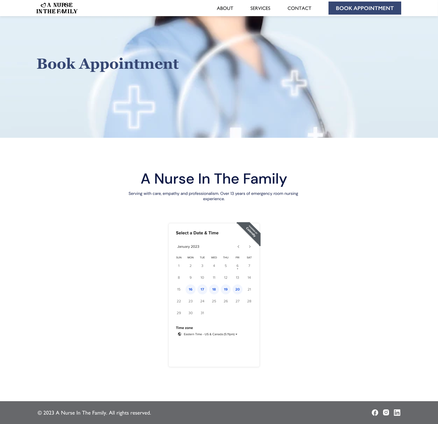
Final appointment page
ACCOMPLISHMENT:
- Created a homepage that meets the customer’s business goals by customer requirement analysis, competitor analysis, and prototyping.
- Led UX conversations with developer and created multiple versions of the design to meet both feasibility and user experience.